
F. Scott Fitzgerald Collection Redesign
A reimagined cover series for The Great Gatsby, This Side of Paradise, and Tender is the Night, built to evoke, not explain.
Designing Covers that Don’t Spoil the Ending
In redesigning the covers for three of Fitzgerald’s most iconic works, my goal was to create a cohesive visual collection that doesn’t dictate how the stories should be felt or interpreted. Instead, I wanted each book to feel like an open door, an invitation to explore.
Inspired by Shigeo Fukuda’s idea that “a cover is like opening credits,” I treated each design as a tone-setter. Rather than summarize the plot, I crafted photomontages that capture the spirit, mood, and emotional undercurrents of the novels.

BACKGROUND + PROBLEM REWRITING THE VISUAL NARRATIVE
Most editions of Fitzgerald’s work lean heavily on cliché: Art Deco motifs, gilded fonts, or flat abstractions. While beautiful, they often feel emotionally disconnected. I wanted to shift that.
This redesign answers a simple question:
What if the covers gave the reader a feeling, not a plot?
PROCESS FROM MOOD BOARD TO MONTAGE
Each design started with research. I explored the themes, environments, and emotional arcs of each novel, then layered imagery to reflect that. Using photomontage, I combined landscapes and architecture with characters inspired by Fitzgerald’s prose, never literal portraits, but echoes of emotion.
My process included:
Sketches and mind maps
Image sourcing and compositing
Iterative feedback from faculty and peers
Typography and layout refinement
Caption ideas for process shots:
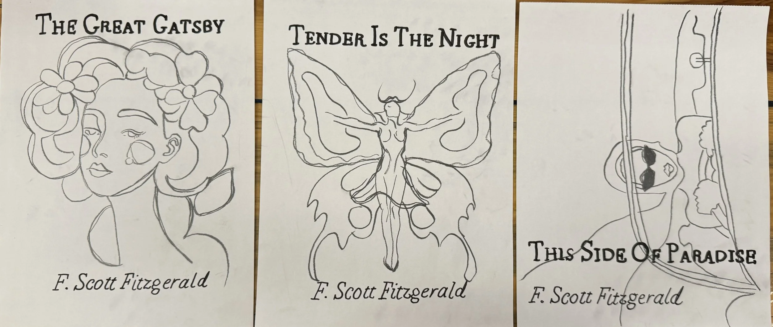
Sketching structure, not style.
Moodboarding with restraint: emotion leads, aesthetics follow.
Photomontage progress, from fragments to feeling.
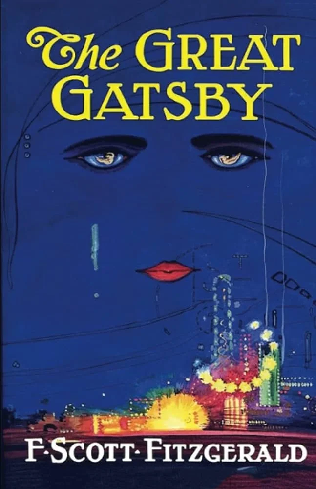
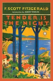
Nature and Narrative: The Visual Journey Behind the Covers


First and Second Addition Book Cover Designs

Iterative Sketches of the Cover Concepts
Designing Around Restraint
The hardest part? Not saying too much.
The temptation to explain the story visually was constant, but I kept asking: “What’s the tone? What’s the tension? What’s the question this story asks?”
Key Challenges:
Cohesion across three very different novels
Avoiding literal depictions of characters
Letting ambiguity create space for imagination
This project taught me to design like a director, not to show every detail, but to set the scene.

A Collection with Room to Breathe
The result is a modern collection that blends metaphor, mood, and memory. I’m proud that the series feels unified yet distinct, and most of all, that it trusts the reader’s imagination.
This project is a reflection of my creative identity:
Part artist. Part designer. Always dancing between clarity and curiosity.


