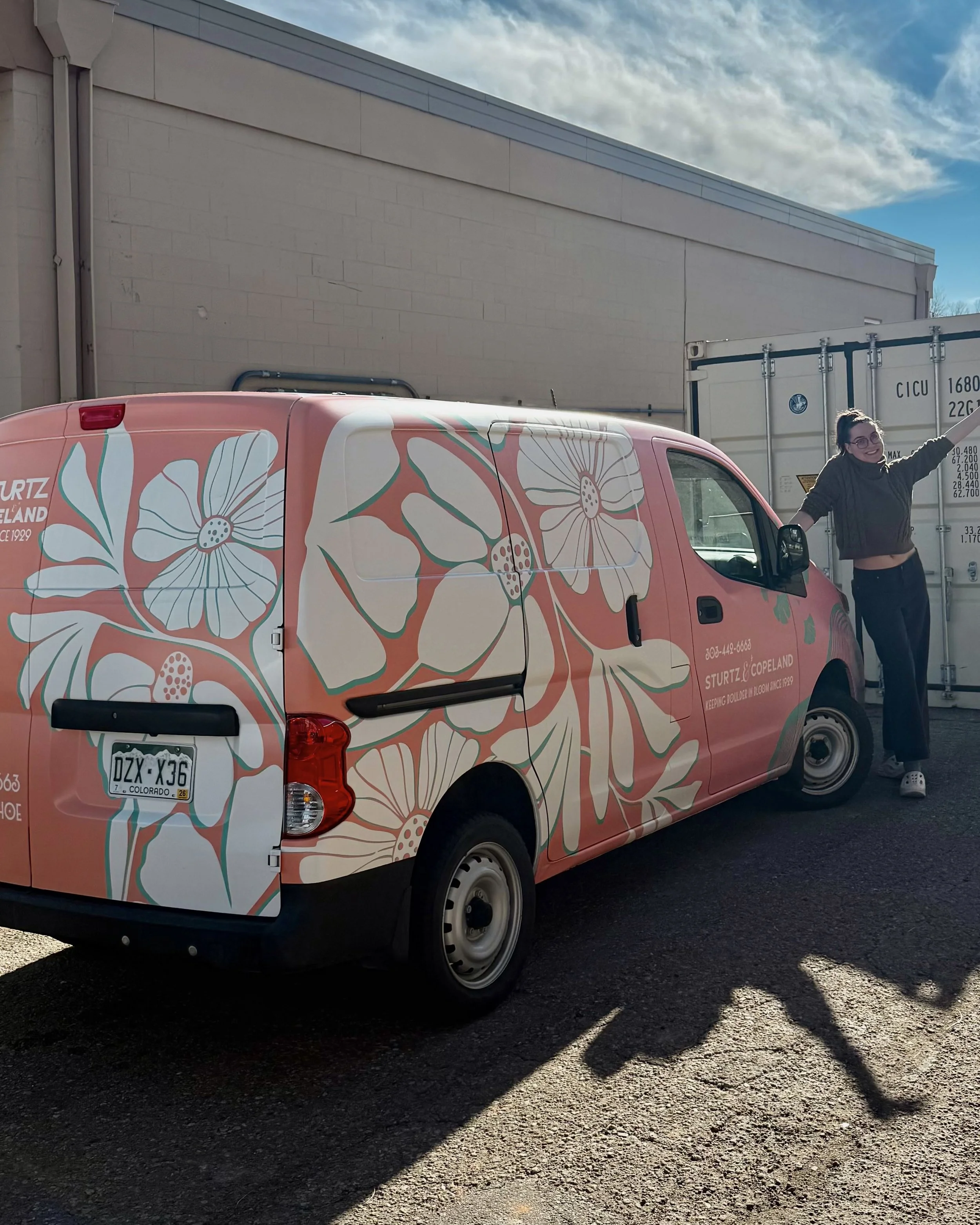
Sturtz & Copeland
Where Nature and Identity Intertwine
2021–2025
Brand Experience Design · Art Direction · Visual Systems
ROLE
Brand + Marketing Designer
Visual Identity · Strategy · Typography · Art Direction
In-house with the marketing team at Sturtz & Copeland, Boulder, CO
Started With a Shovel, Ended With a System
I started at Sturtz & Copeland in 2021 working in the garden center, hauling perennials, learning the names of native plants, watering more ferns than I can count. Over the years, I shifted into houseplant care, floral design, and eventually became the shop’s unofficial design point-person.
By spring of 2024, I was invited to join the marketing team officially, just as I was entering a semester-long graduate design studio focused on brand identity. The timing was too good to ignore: I chose Sturtz as my studio project and set out to build a new brand system for the place that had shaped me for years.
This was more than a visual refresh. It was a translation of values into visuals, memory into system, feeling into form.

I know this looks like a lot but HEAR ME OUT!
Sturtz makes my heart so happy!
Designing for a Brand I Lived Inside
Most identity work starts from the outside in. Mine started from the inside out. I knew this brand not as a designer, but as a person who cleaned the greenhouse, arranged stems on a deadline, and watched customers fall in love with one perfect flower.
That proximity gave me unique insight, but it also meant I had to work hard to zoom out. The brand needed to honor legacy and create a cohesive experience across platforms: digital, print, and spatial. It needed to reflect the messiness of nature while still functioning like a design system.


Discovery: What Already Worked? What Didn’t?
I began with immersion:
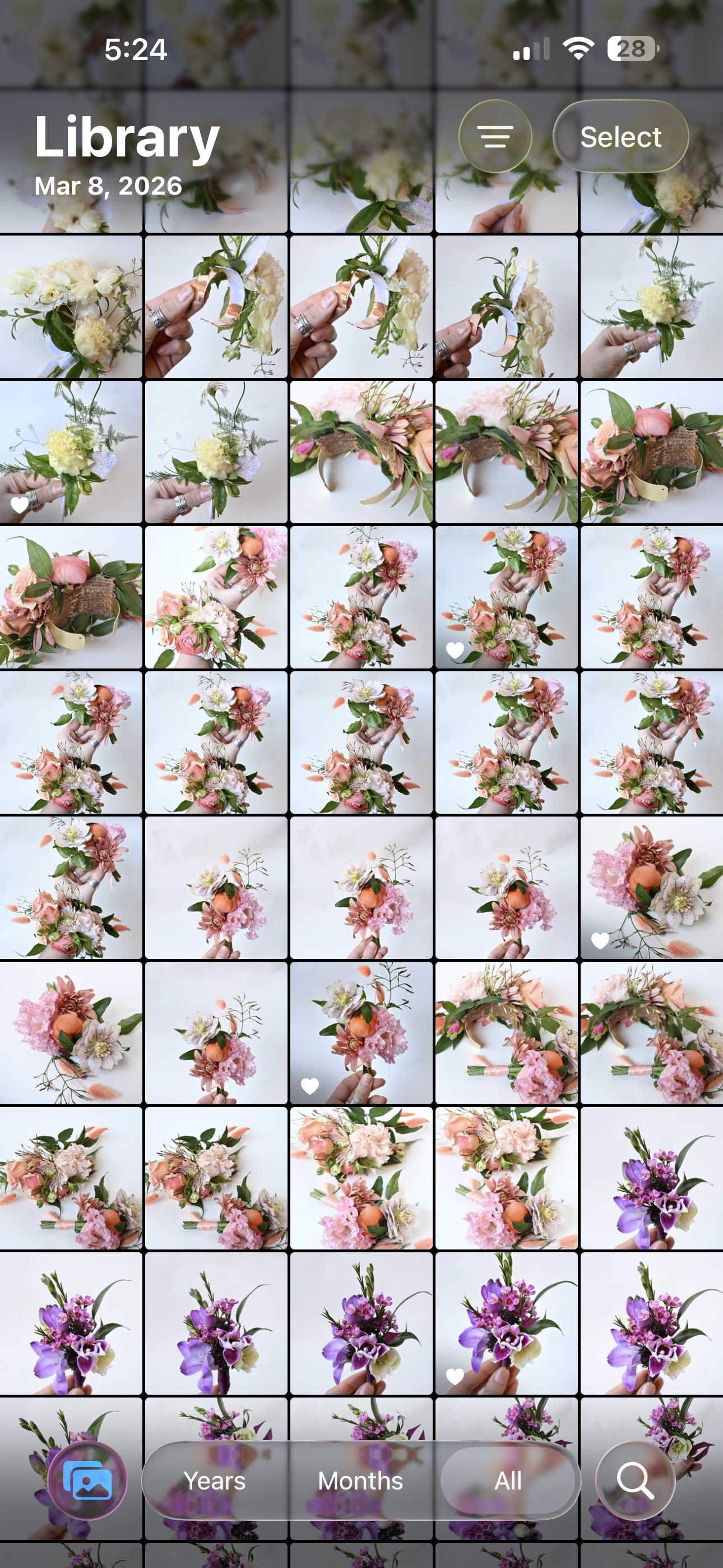
– Brand audits of existing materials (ads, cards, tags, signage, posts)
– Informal interviews with team members, from retail to management
– Archival research into Sturtz’s 95-year history
– Review of customer reviews, workshop feedback, and newsletter data
Patterns began to emerge:
– The shop’s warmth and artistry were its signature, but its materials lacked consistency
– There were strong aesthetic instincts in the team, but no shared framework
– Customers loved the in-store experience, but the digital touchpoints fell flat
These insights grounded my goals: preserve what people love, build what the team needs, and help the brand feel whole from stem to story.


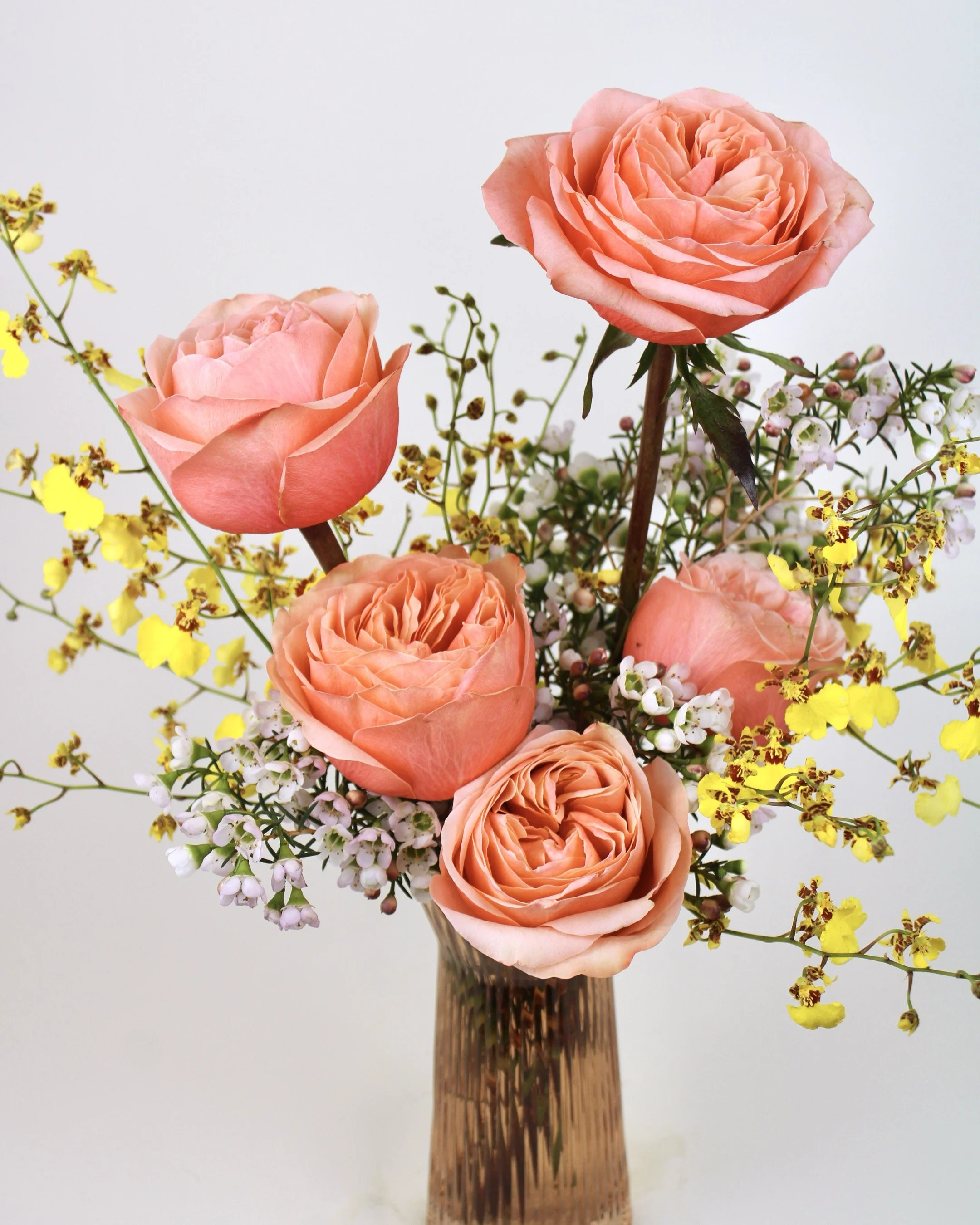
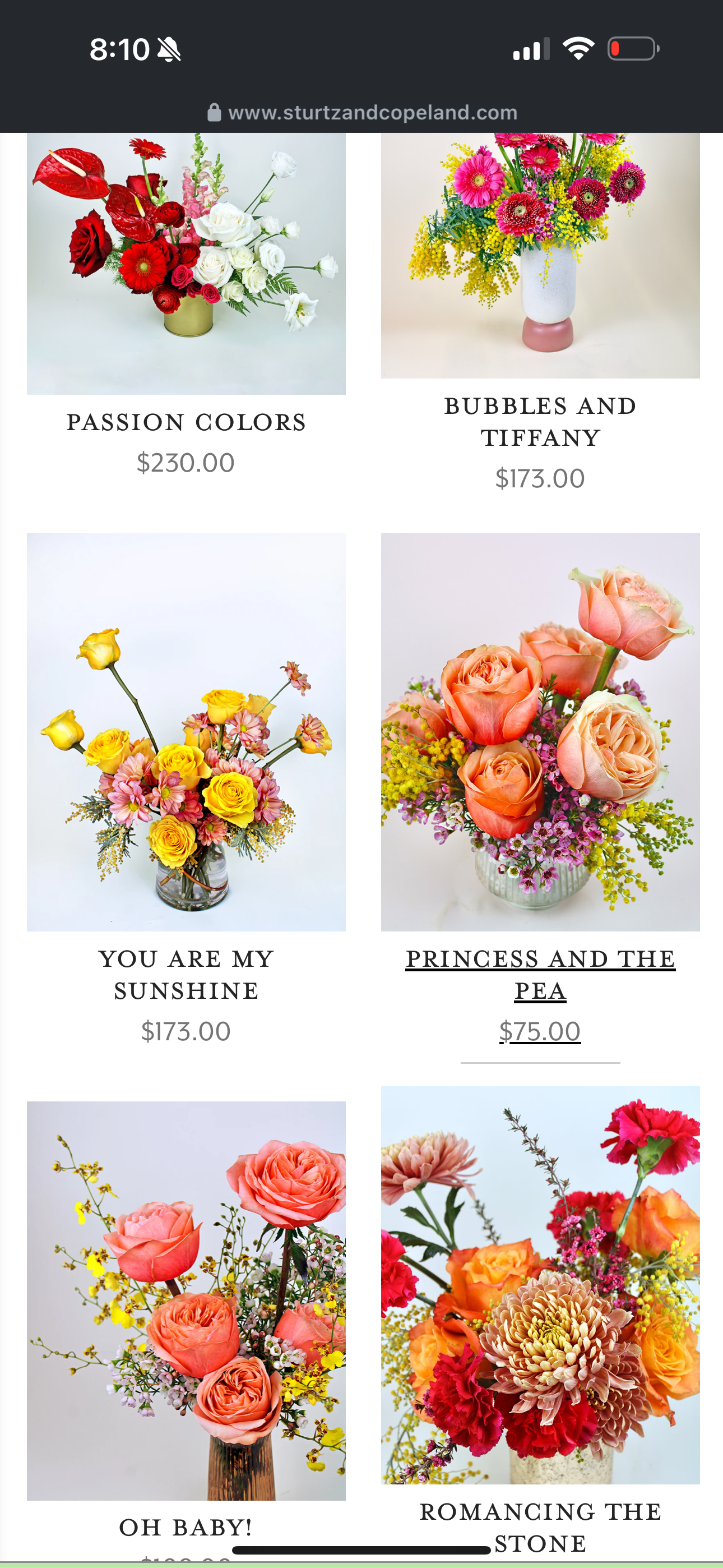
A Palette of Personality and Permission
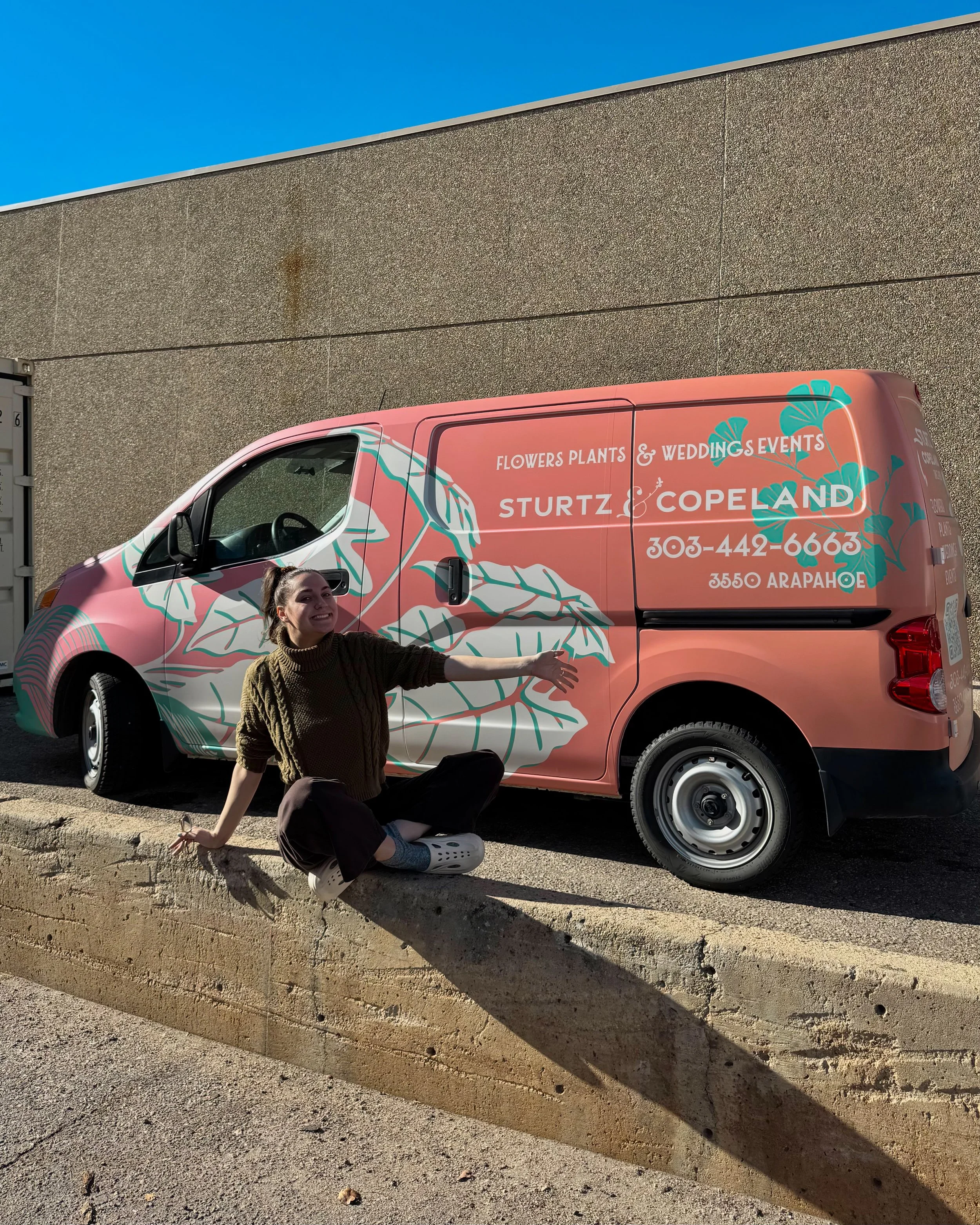
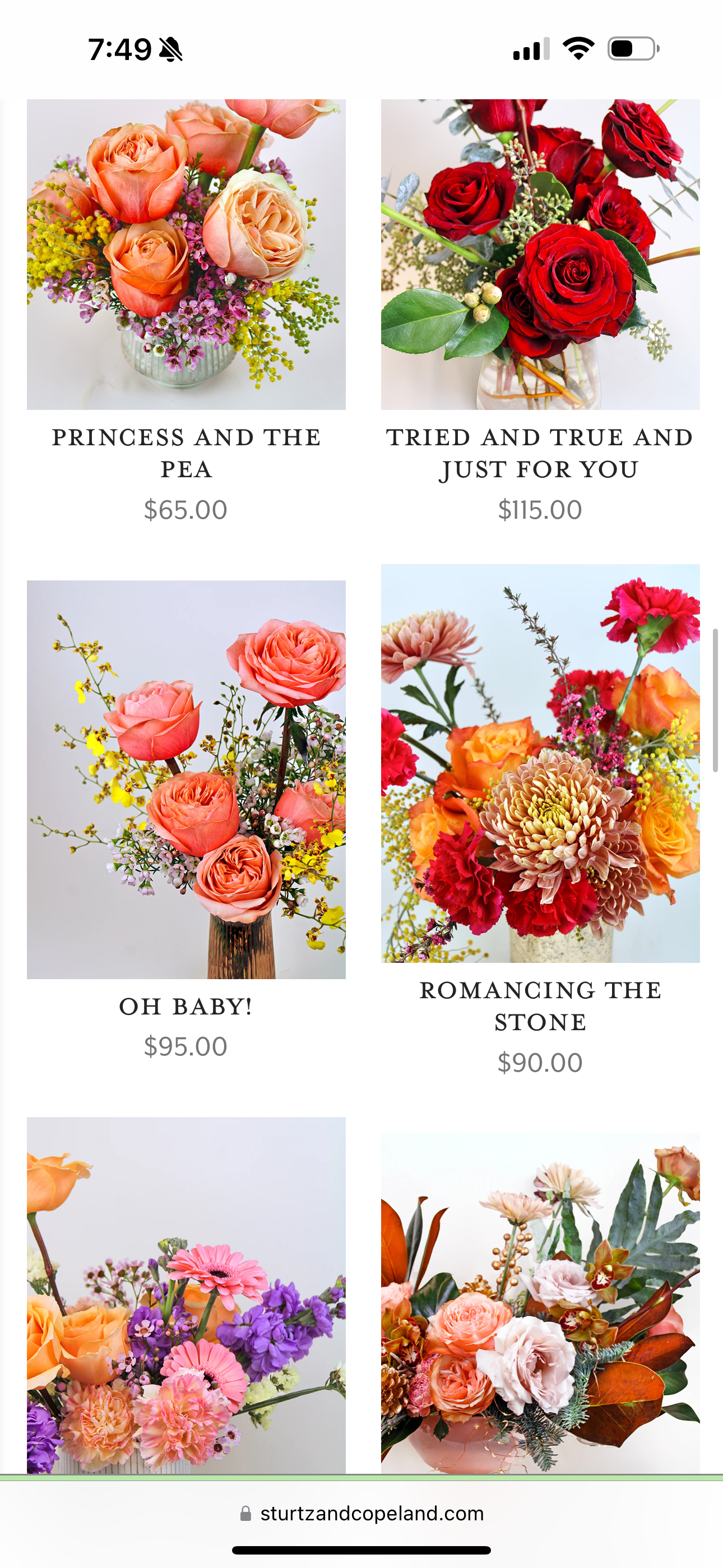
The first big design task: color. The shop was already full of it, seasonal flowers, changing light, handmade objects. My job wasn’t to impose a new palette, but to extract a repeatable language from what already felt right.
I created a modular color system inspired by real flora, earth, and light:
– Pouring Copper for warmth and grounding
– Duckling Carnival for play
– Whirlpool Waterfall for calm
– Daiquiri Olive for quirk and nostalgia
– Neutrals rooted in soil, bark, and morning mist
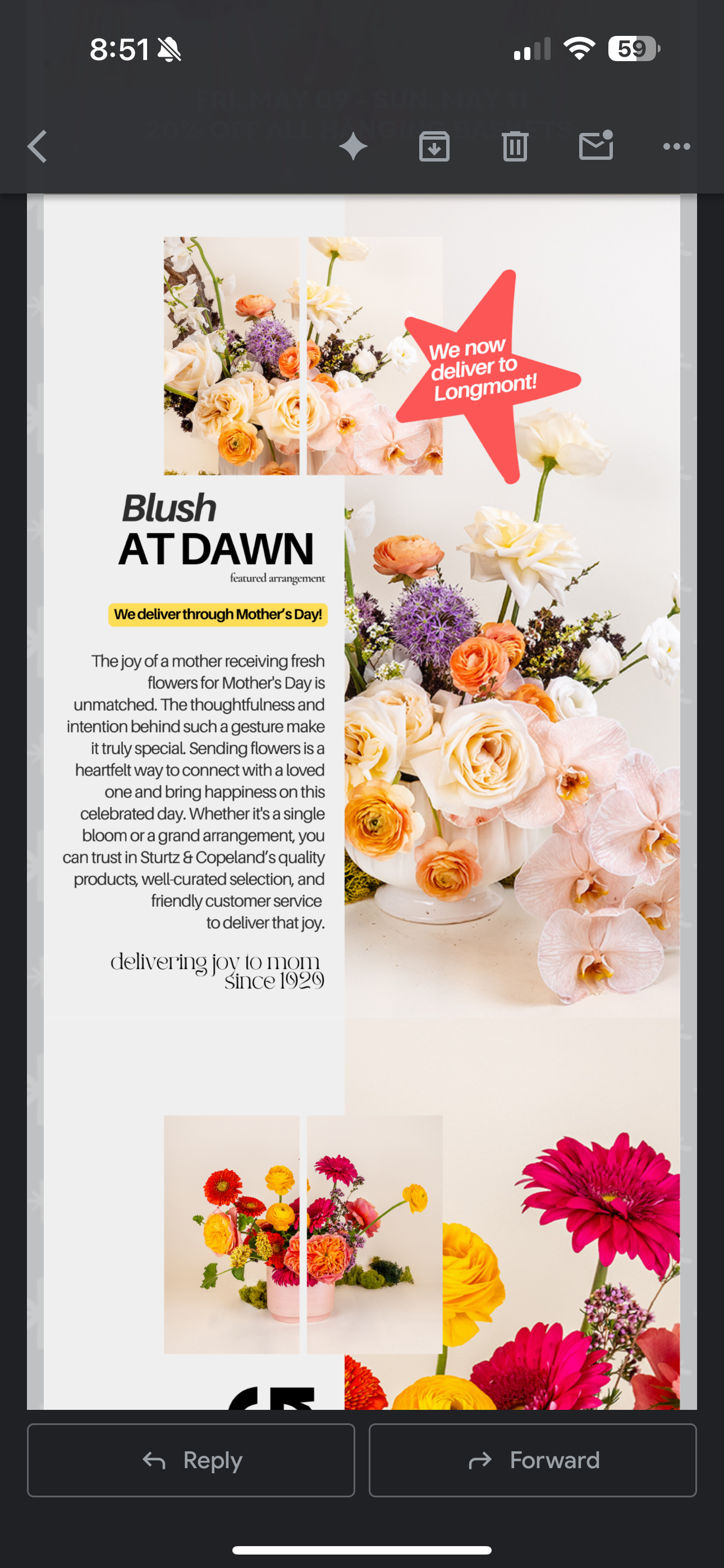
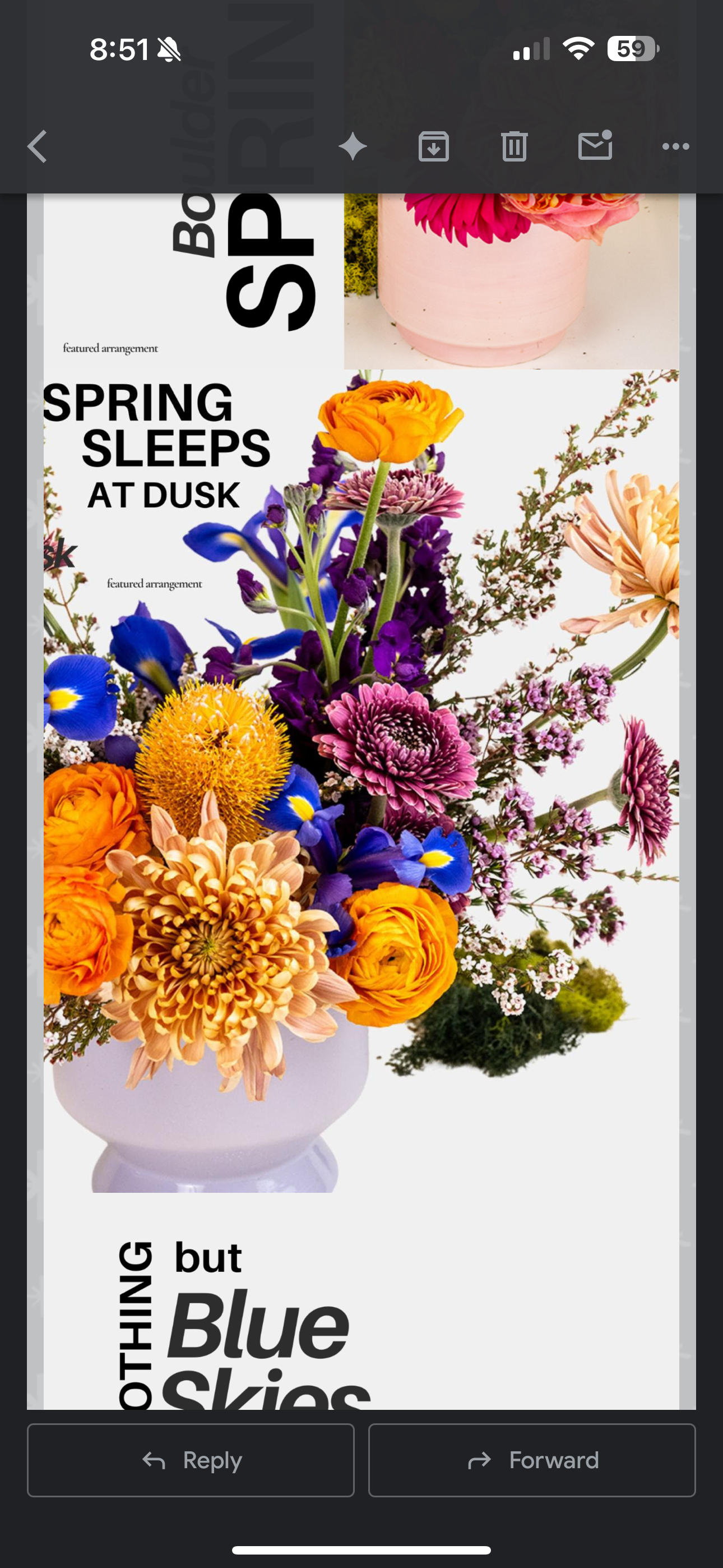
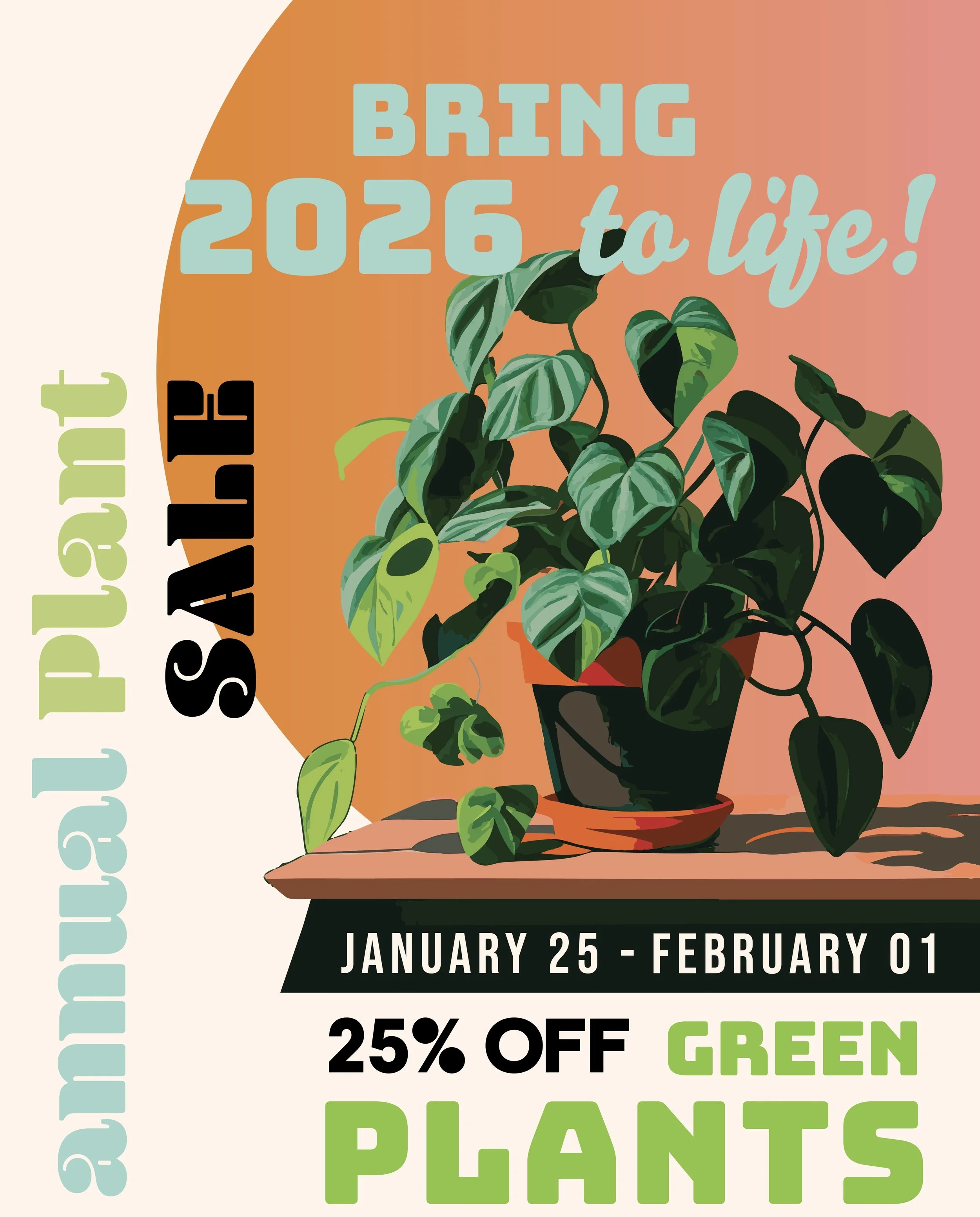
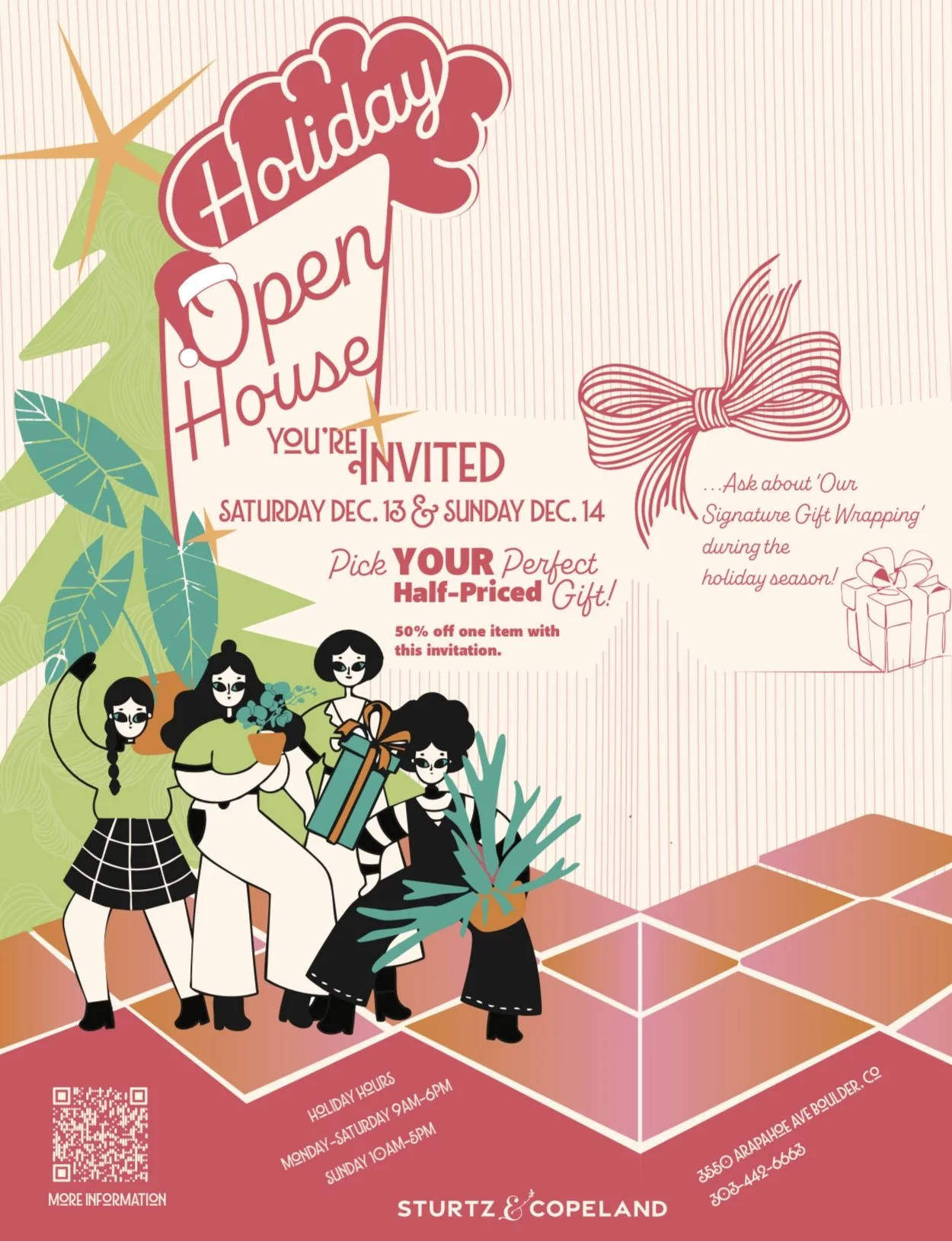
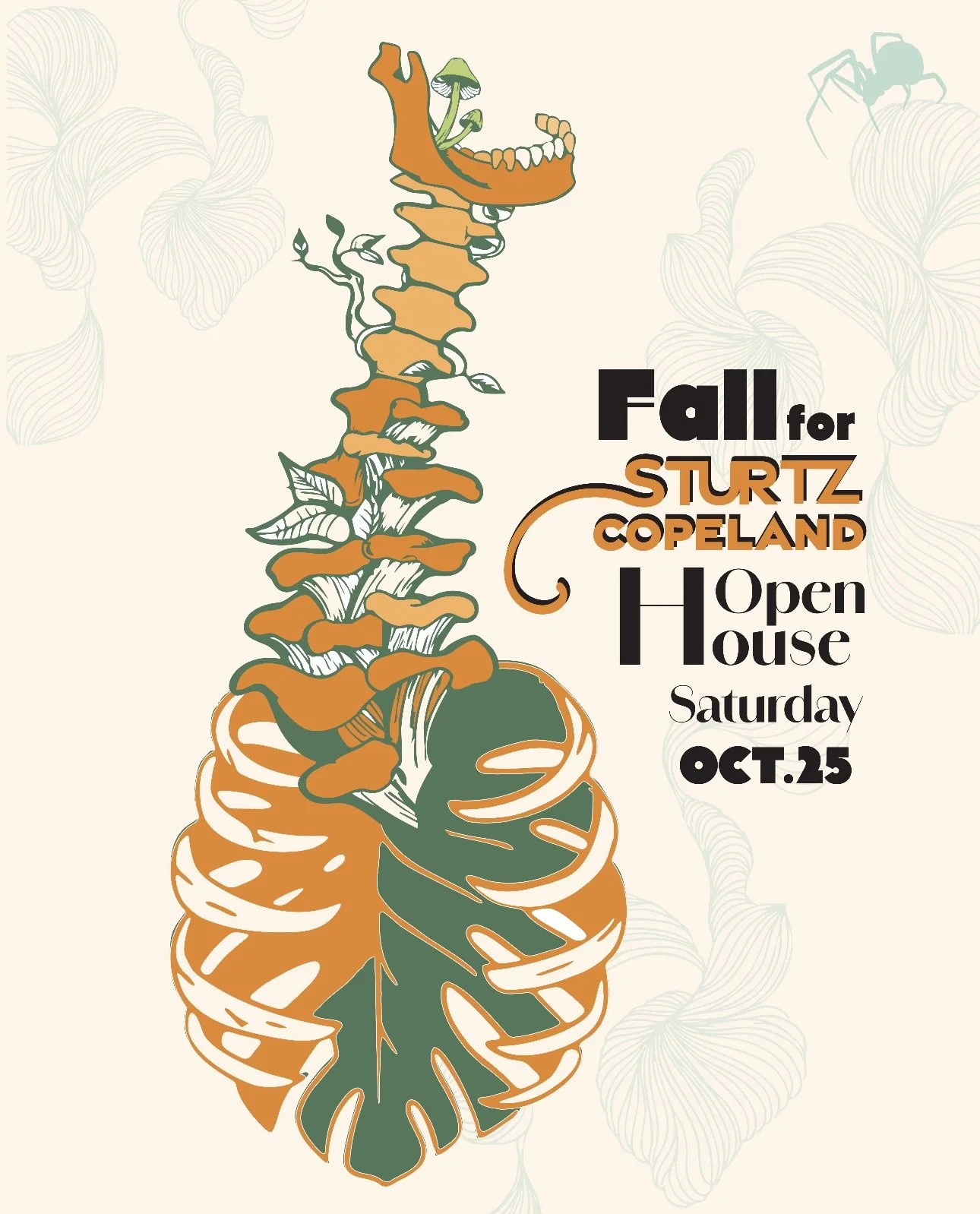
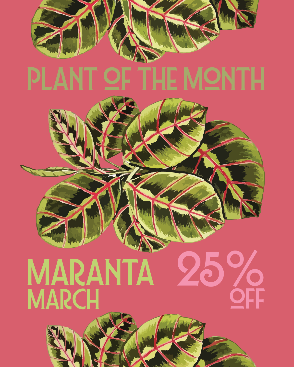
The palette was designed to flex, elegant enough for wedding collateral, bold enough for seasonal promos, and simple enough to reproduce across print and digital.
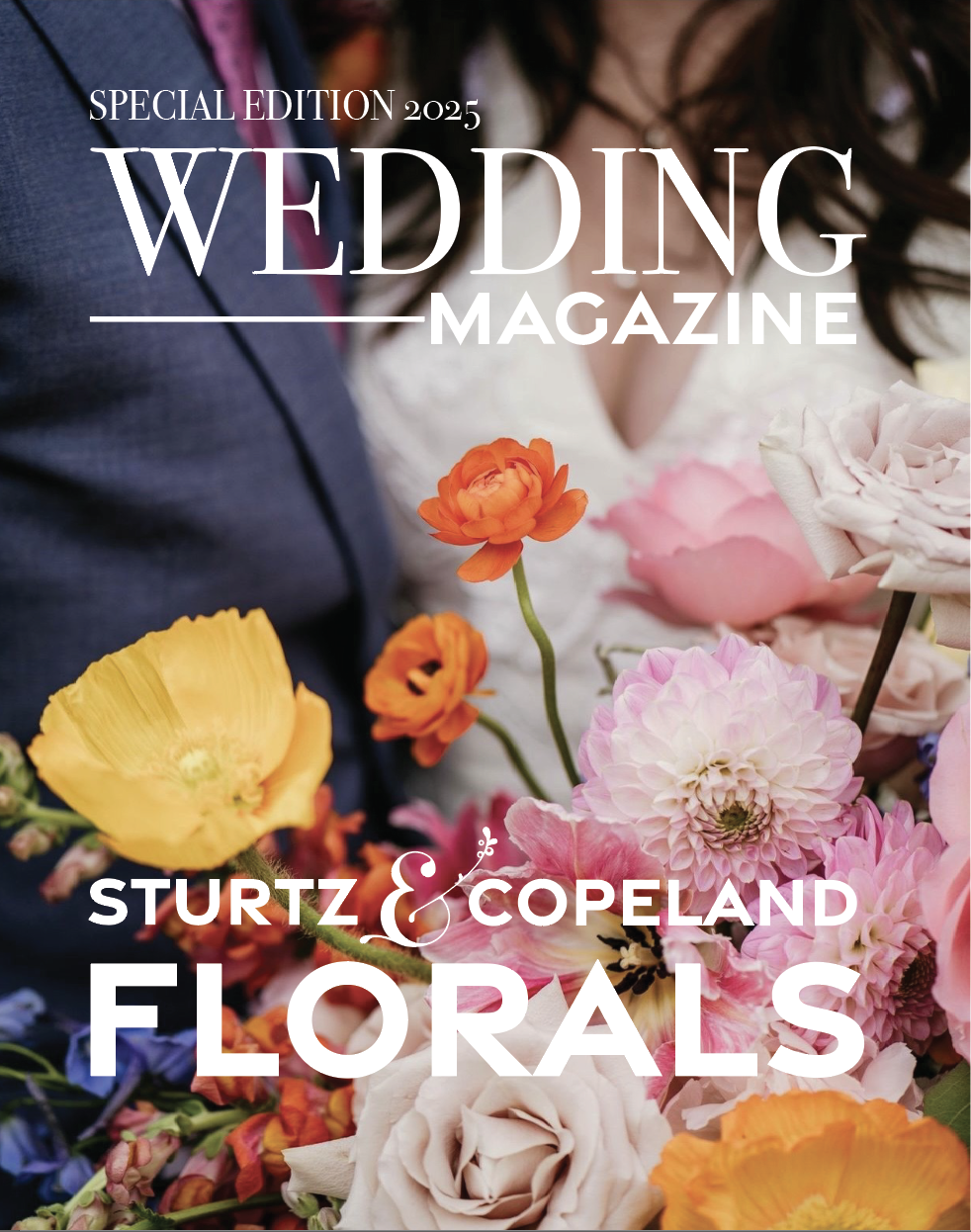
Type, Texture, and Tactility
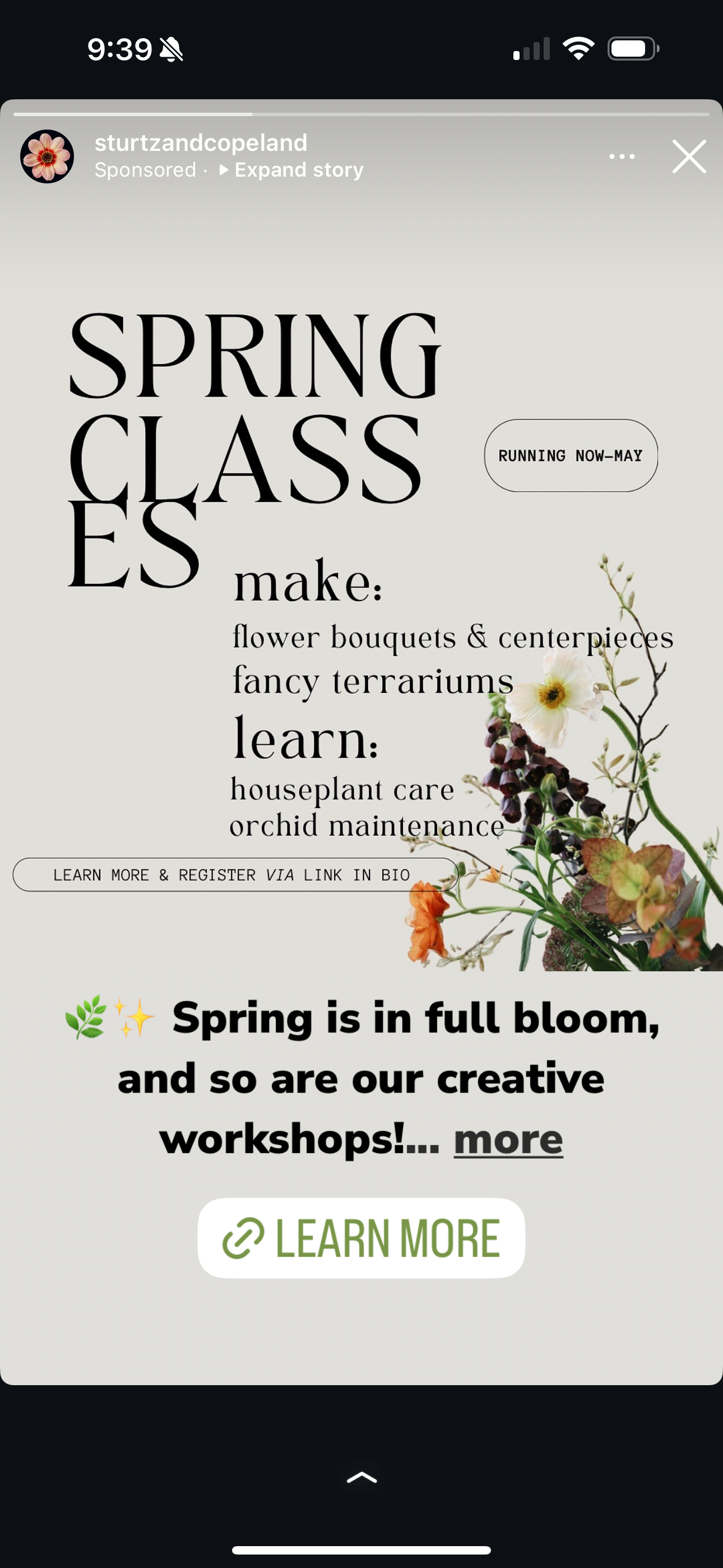
Typography needed to speak to both heritage and freshness. I paired Bodoni 72 Smallcaps with Coquette and Gravesend Sans to reflect the shop’s layered identity: part traditional florist, part modern design studio.
I built out a ten-tier heading system, body styles, and use cases, all grounded in the design token logic I developed through my thesis work. Each style had a role, and each role supported scalability.
I also introduced a system of graphic elements, simple patterns, soft textures, and botanical flourishes, that could extend the brand visually without overwhelming it.


Voice, Archetypes, and Character
We anchored the brand’s voice to three Jungian archetypes:
– The Caregiver, for warmth and customer focus
– The Creator, for artistic spirit
– The Sage, for knowledge and plant expertise
From these, I helped shape copywriting guides and a tone that could stretch across platforms, from clever Instagram captions to heartfelt sympathy card enclosures.
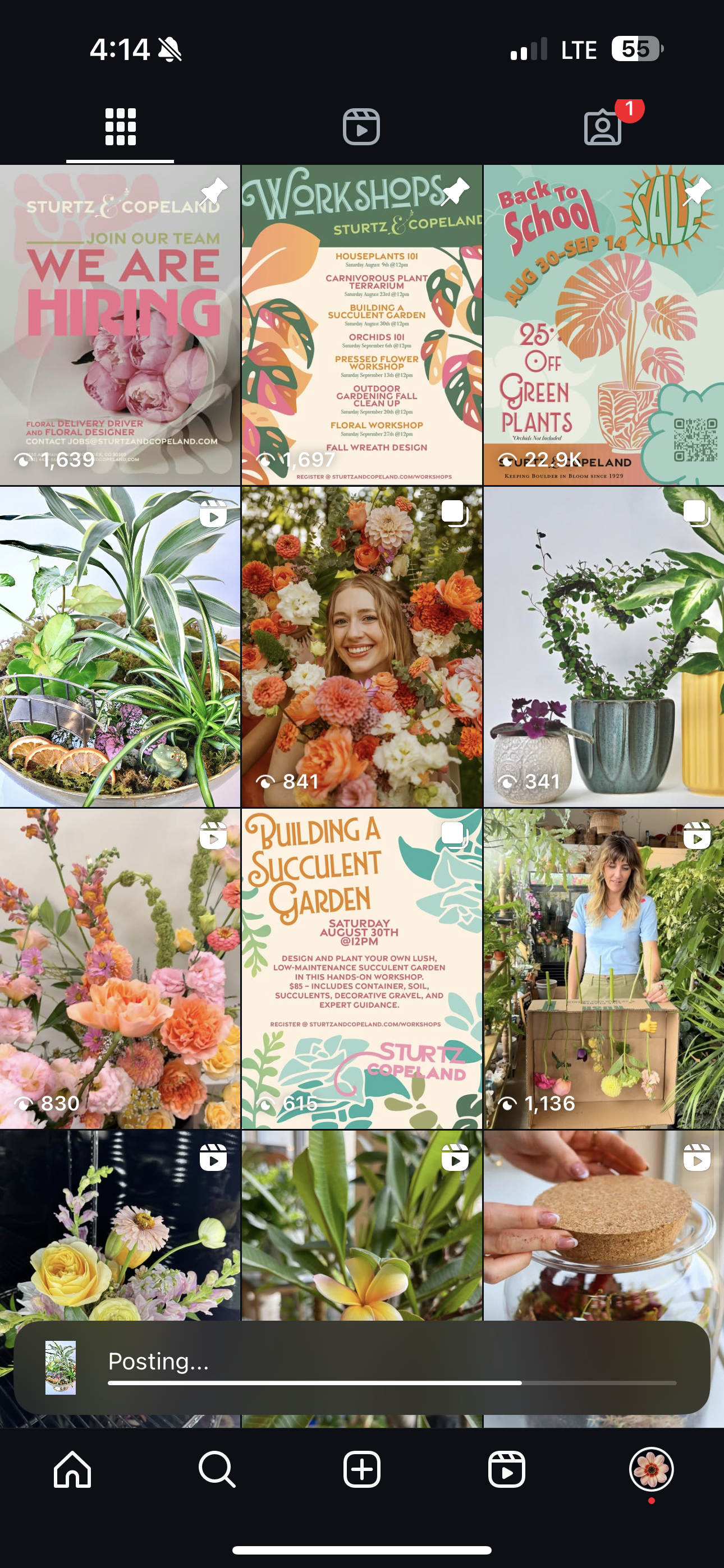
A System Meant to Be Shared
Everything was designed for the team to use. I didn’t want to create a polished presentation that no one could touch, I wanted to leave behind a living system.
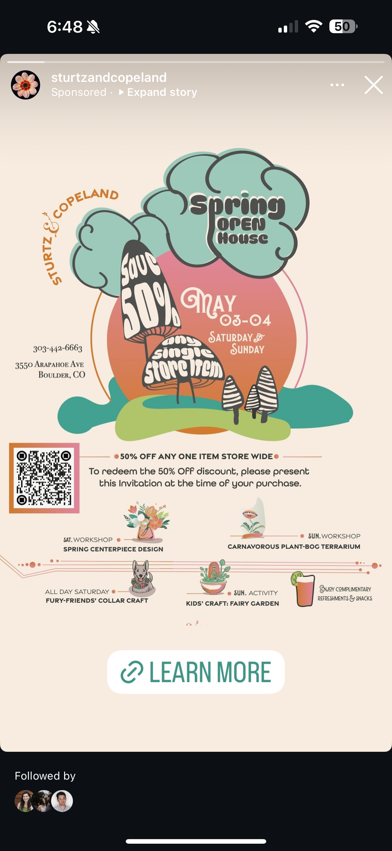
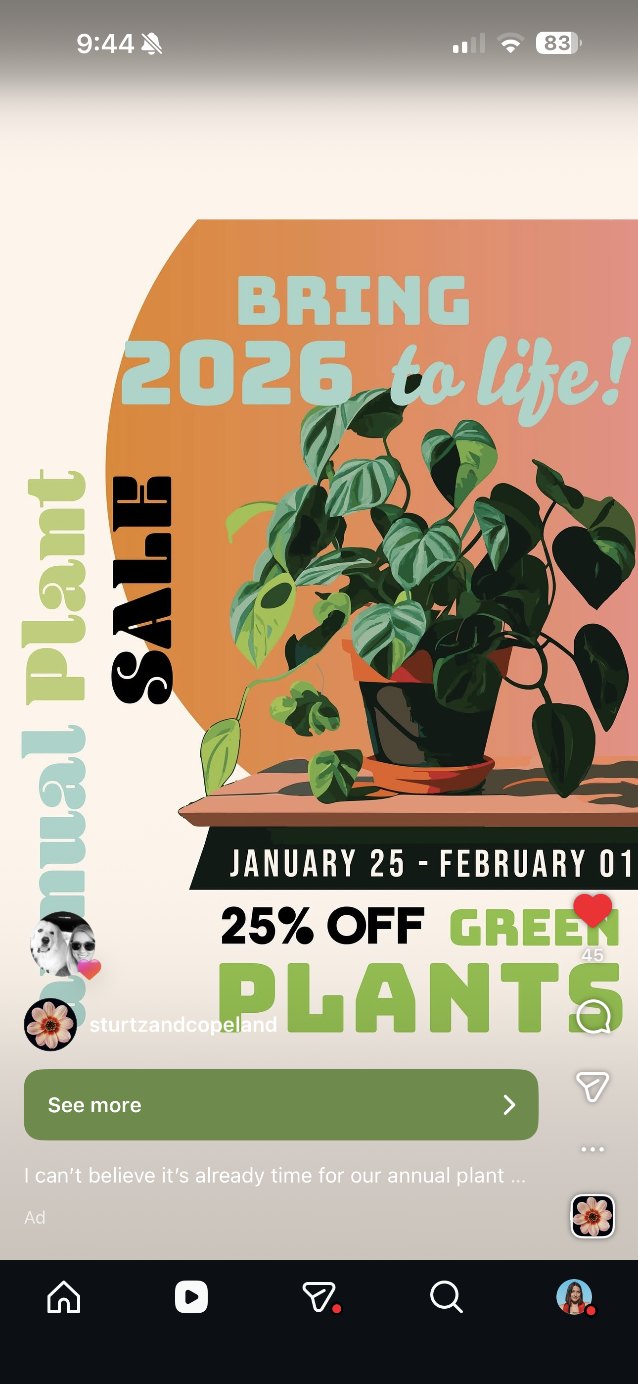
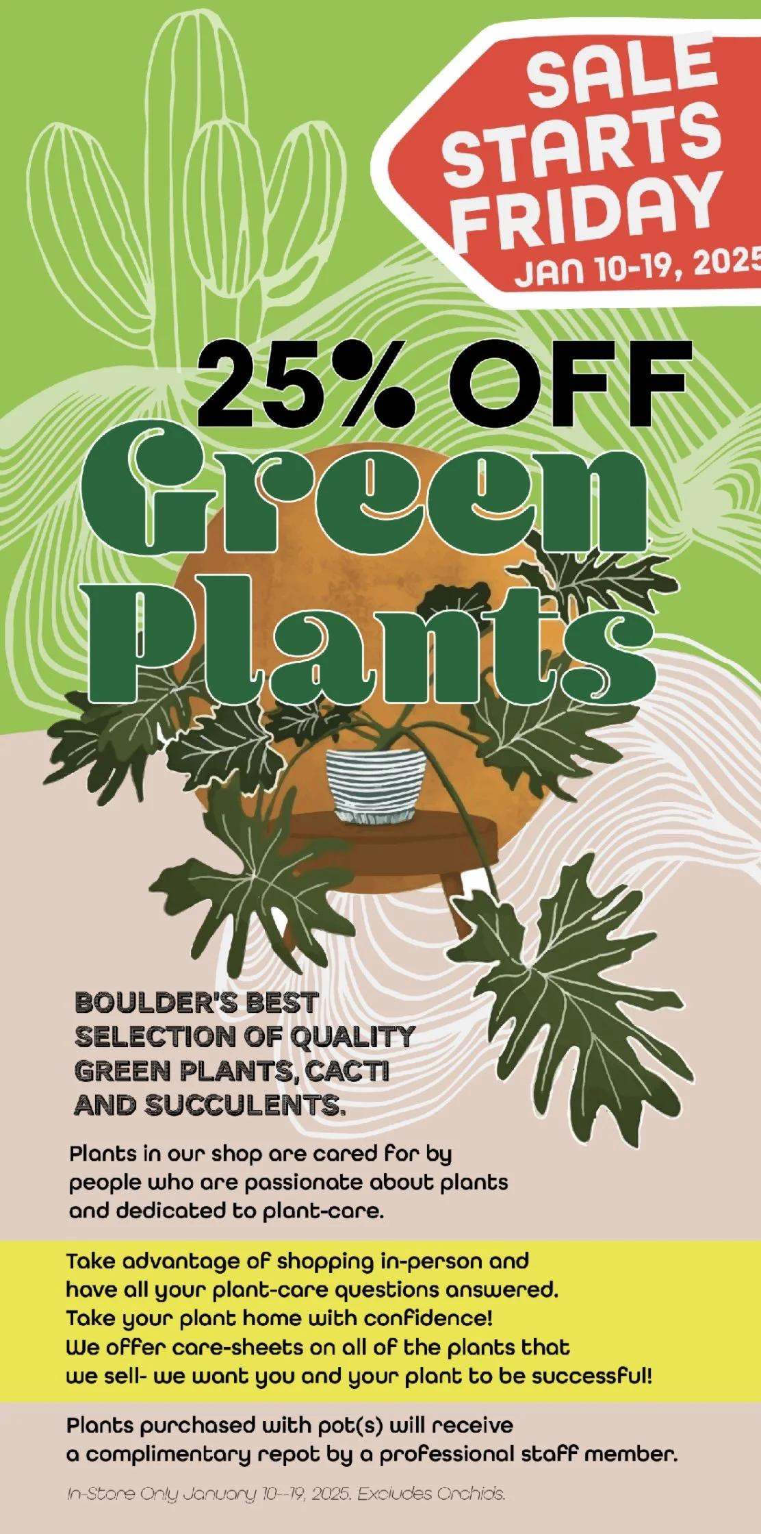
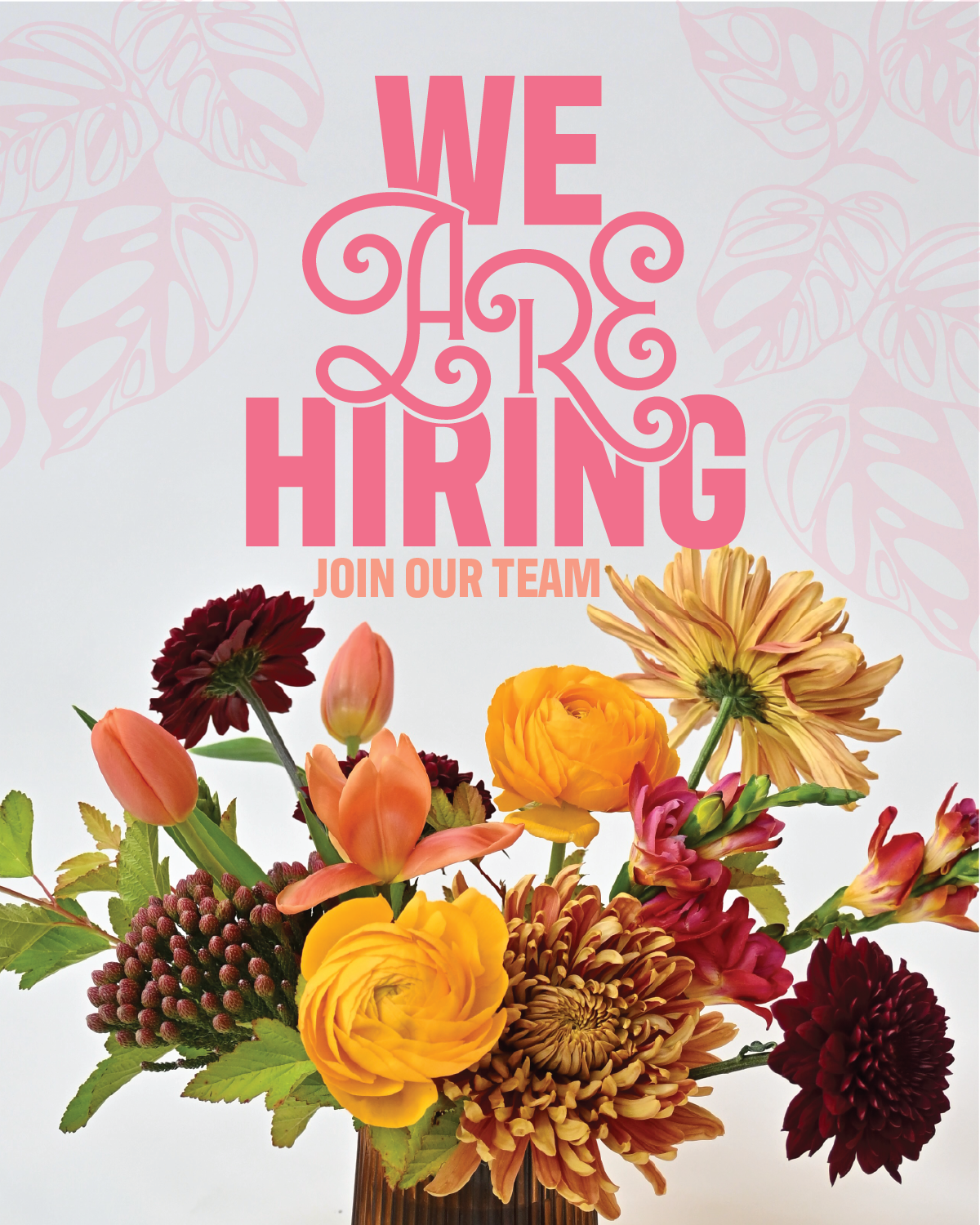
Deliverables included:
– A full brand guide with usage instructions
– Social templates in Canva and Illustrator
– Print collateral templates for posters, event signage, product tags
– Packaging guidelines and sticker systems
– A training session for the team
Most importantly, I set a tone: consistency with room for intuition. Guidelines that didn’t just say “don’t,” but showed “here’s how.”
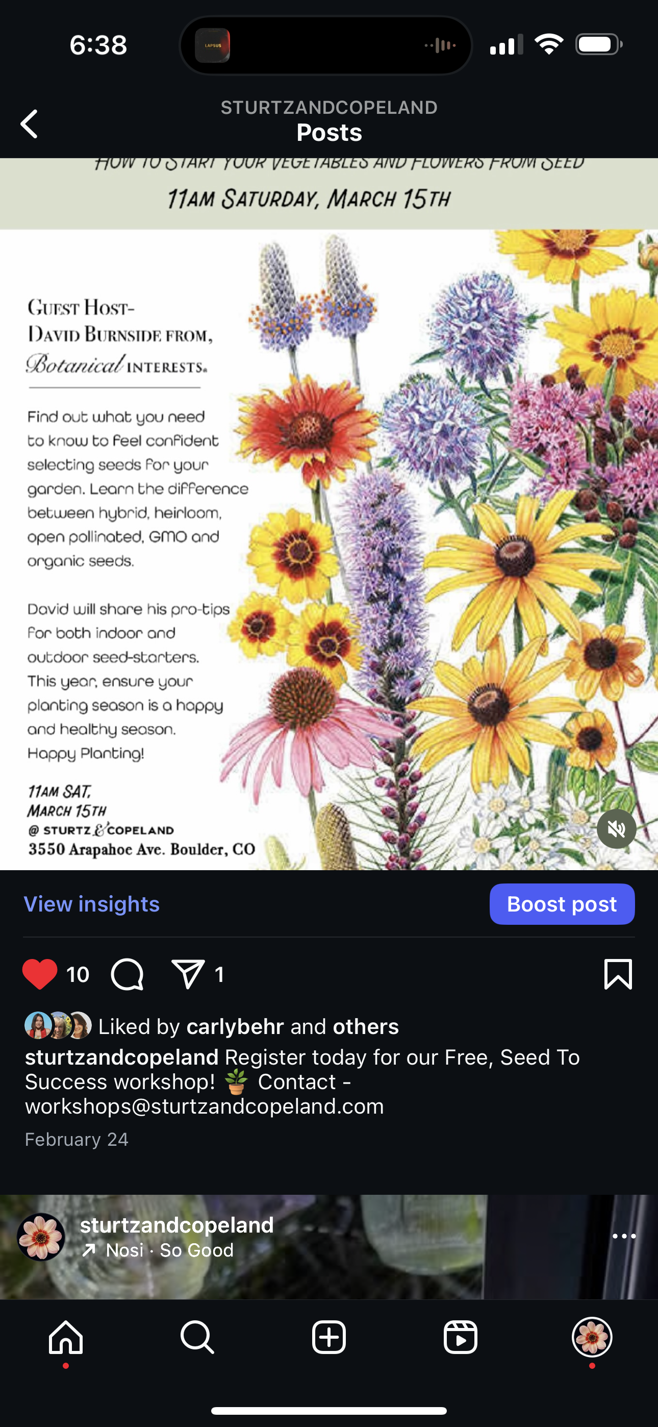
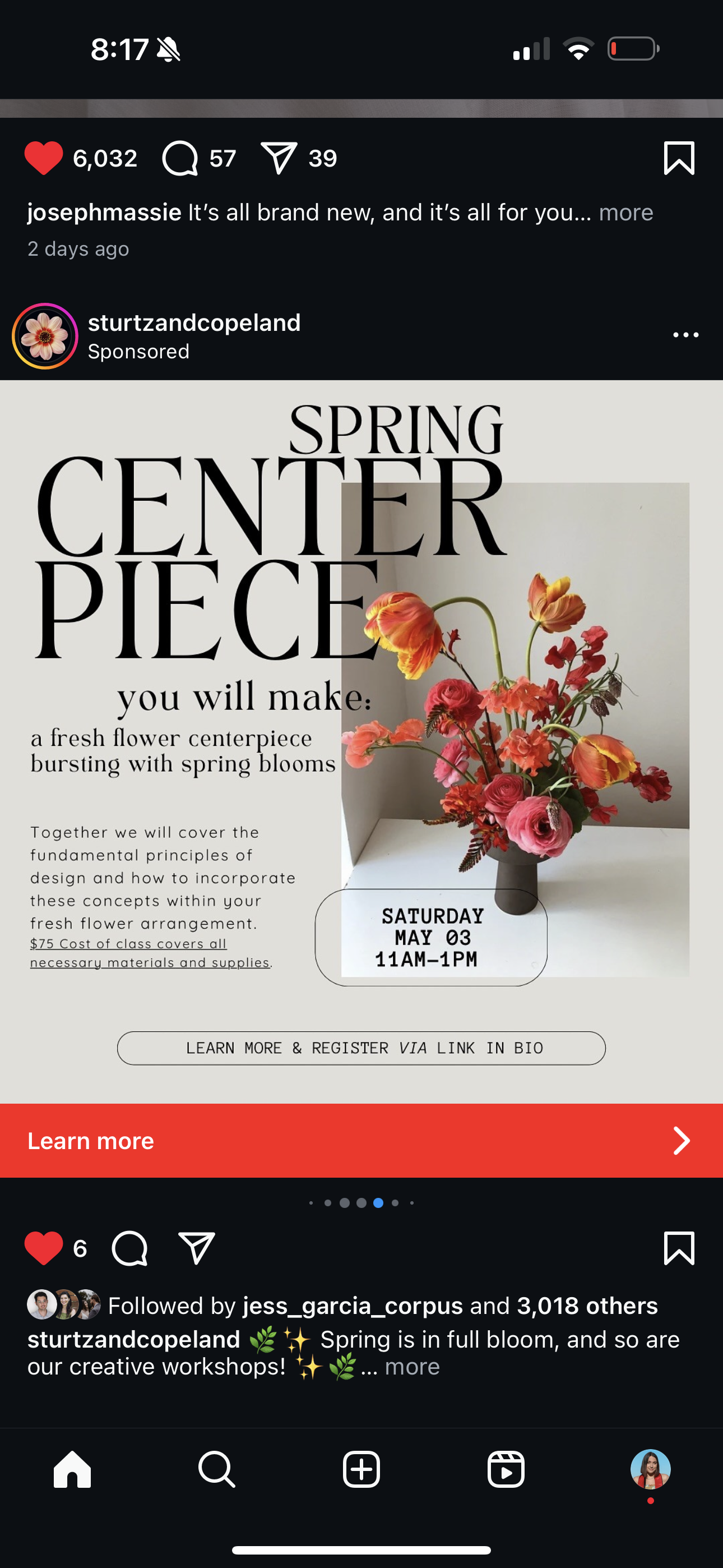
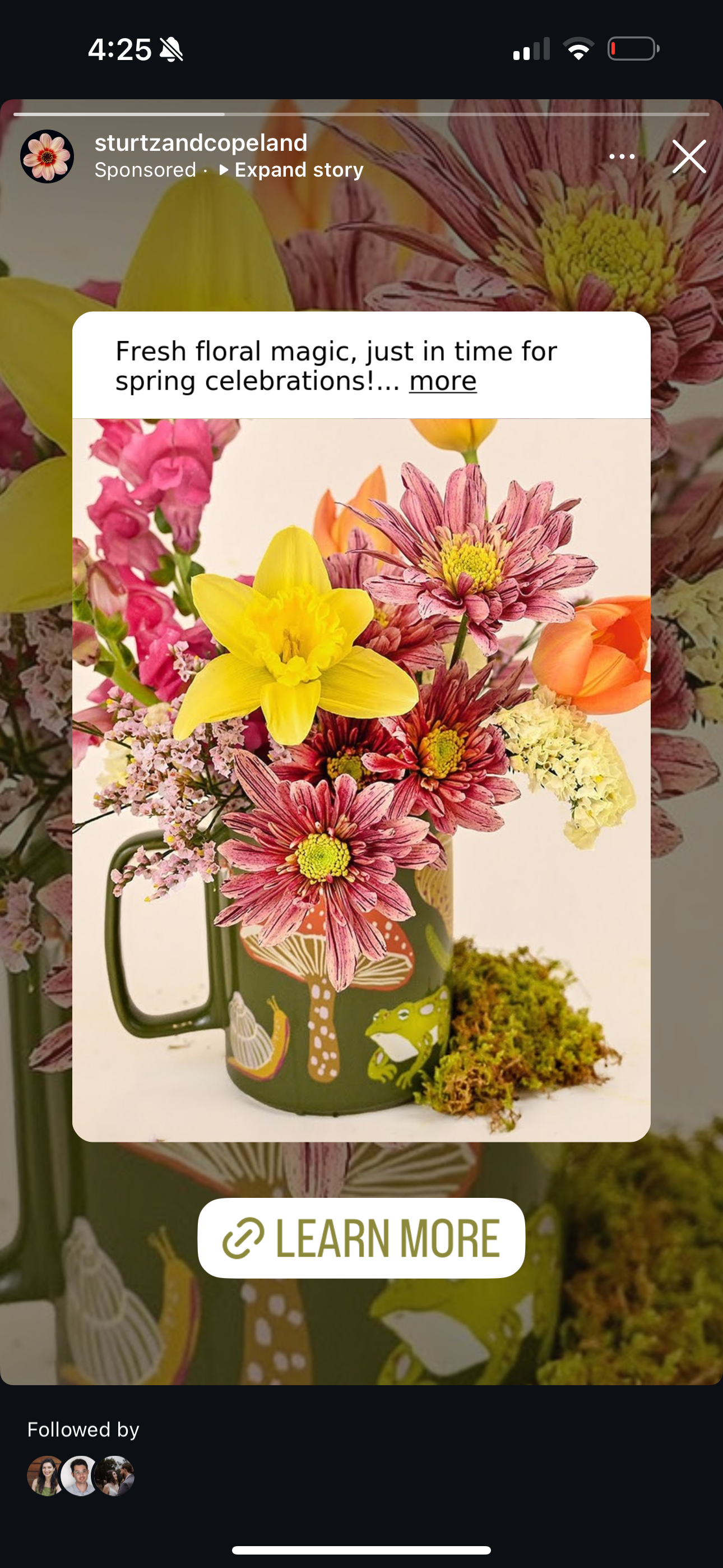
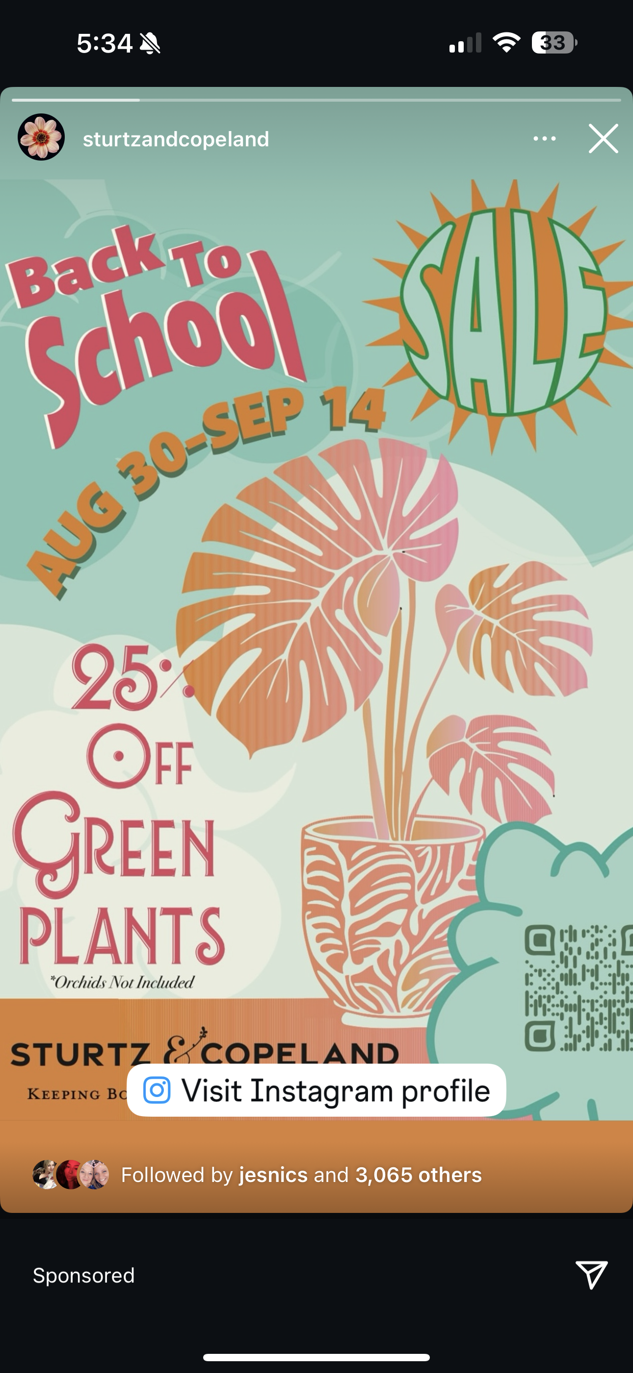
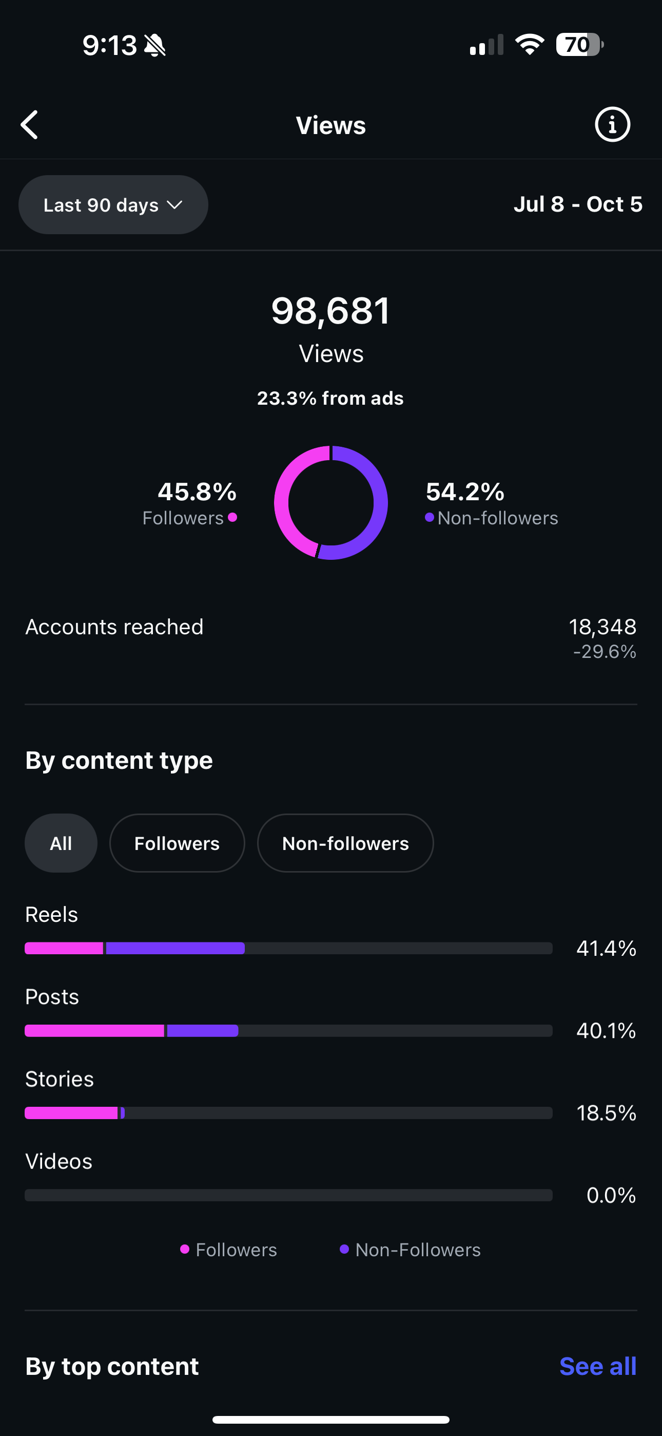
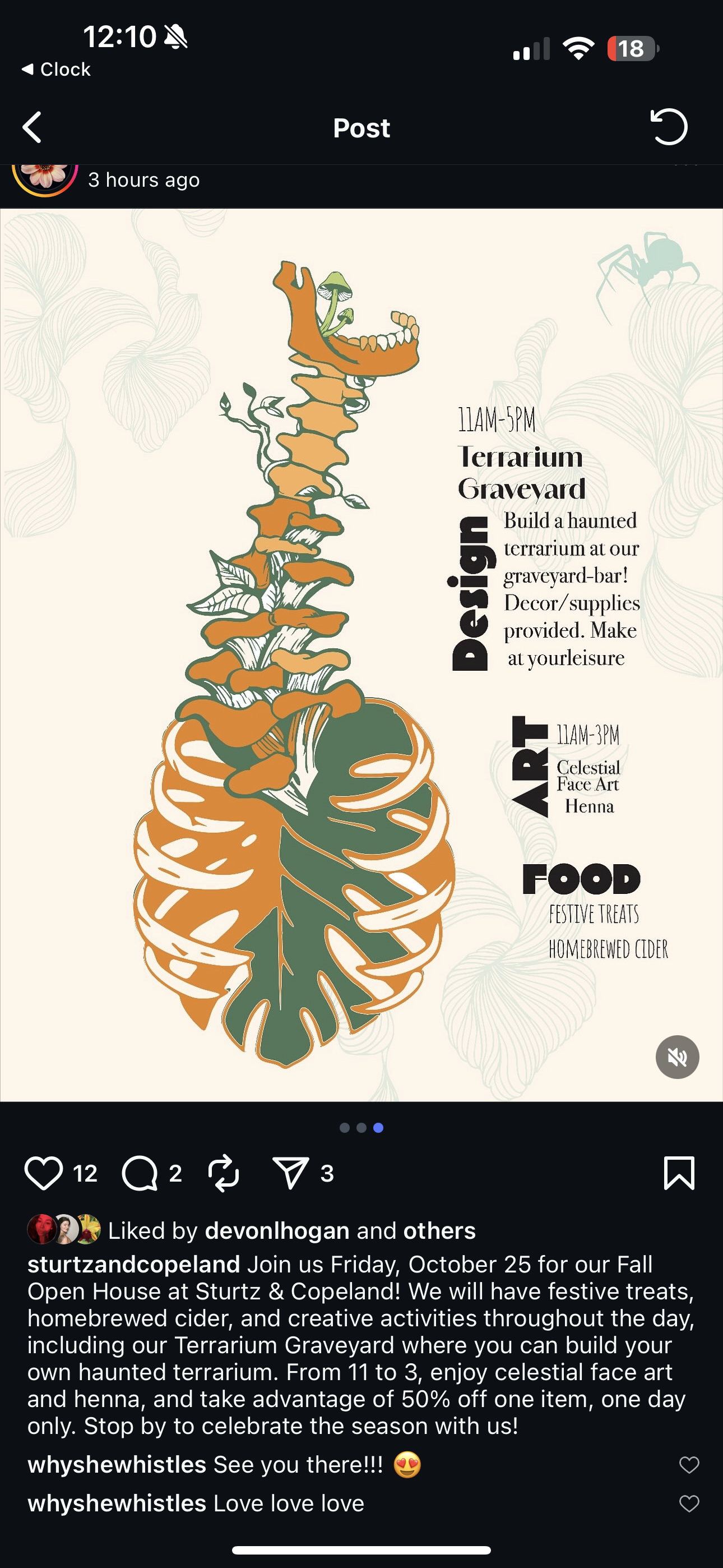
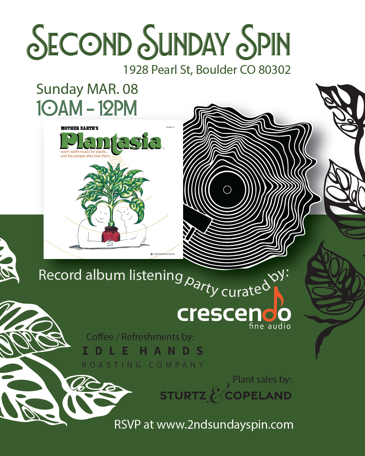
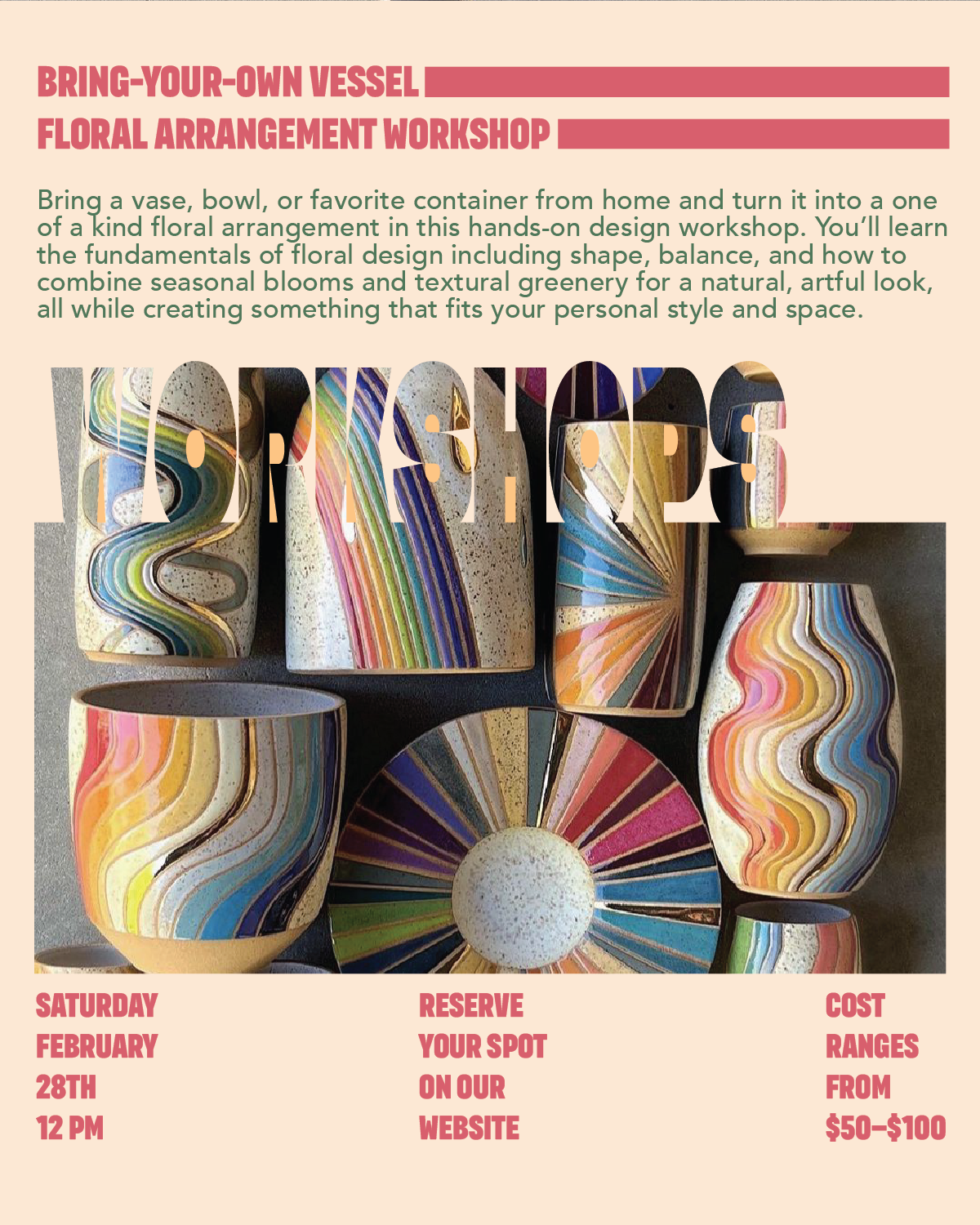
From Petals to Pixels: Launch and Adoption
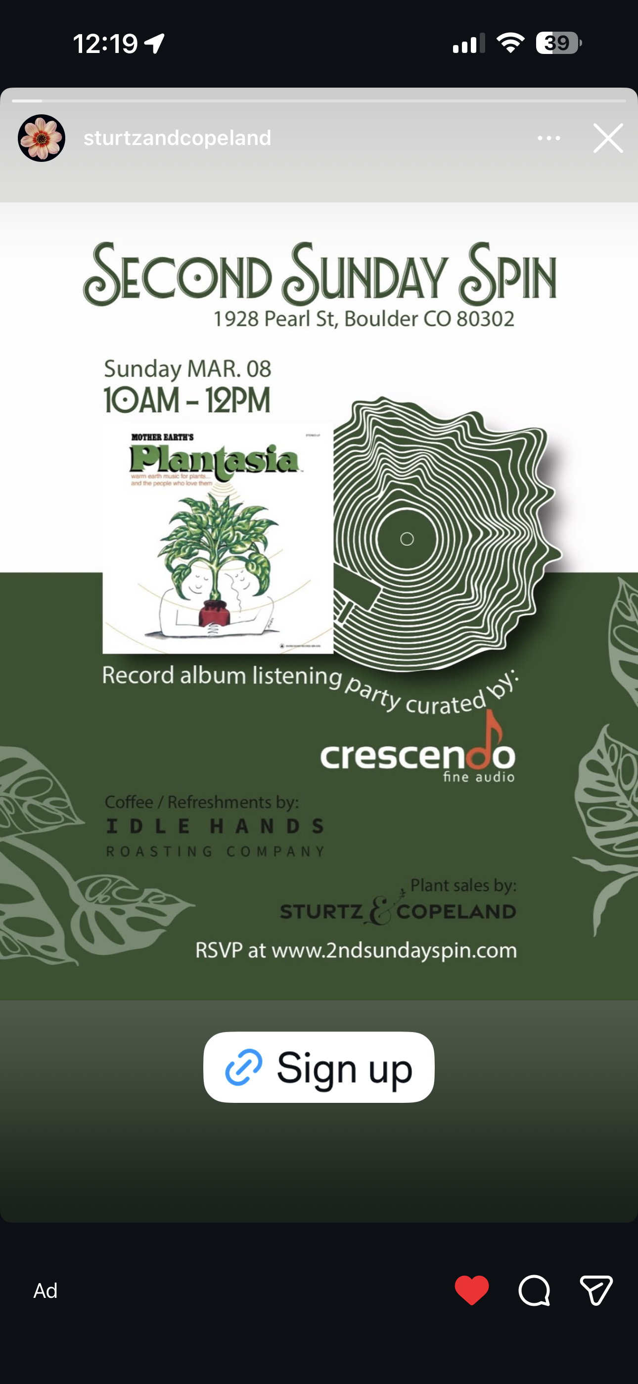
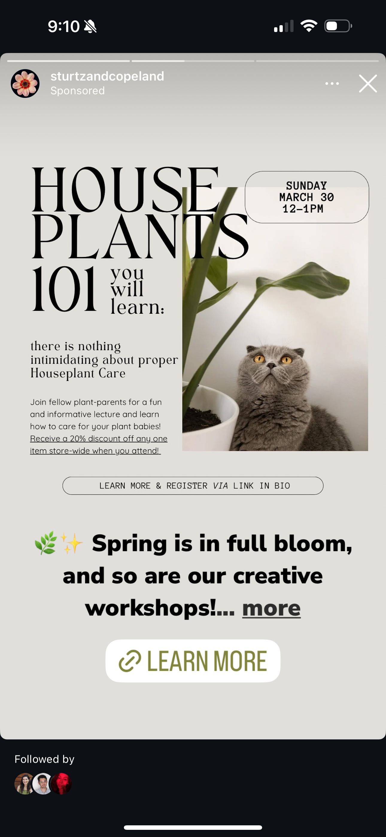
The identity launched slowly, season by season. What started as a class project became real signage, Instagram grids, and newsletter templates. I tracked performance across platforms:
– Instagram: Higher save and share rates on branded visuals
– Workshops: Ticket sales increased on events with unified promotional materials
– Email: A/B testing showed a higher open rate on redesigned templates
– In-store: Customers commented on feeling “more inspired” and “like the brand had grown up”
The most rewarding moment? Watching another designer on the team independently create a workshop poster within the system, and it looked amazeballs.
What I Took With Me
This project taught me how to lead, not just design.
– How to make decisions with others in mind
– How to communicate logic and invite feedback
– How to build for the long term, not just the launch
It reminded me that brand design is about people, how they see themselves, how they show up, and how they create something meaningful together.